Lecture 6 Boxplots and Violin Plots
Boxplots and violin plots are two important tools for visualizing the distribution of data within a dataset. The boxplot highlights the median, key percentiles, and outliers within a dataset. The violin plot takes a kernel density plot, rotates it 90 degrees, then mirrors it about the axis to create a shape that sometimes resembles a violin.
6.1 Data
The Social Security Administration releases data on earnings and employment each year. We’ll take a look at the data for 2014:
https://www.ssa.gov/policy/docs/statcomps/eedata_sc/2014/index.html
We’re going to download Table 1: “Number of persons with Social Security (OASDI) taxable earnings, amount taxable, and contributions, by state or other area, sex, and type of earnings, 2014”
Save that file as ‘ssa_earnings.xlsx’ in the data folder
library(tidyverse)
library(readxl)
ssa <- read_xlsx("data/ssa_earnings.xlsx", range = "A7:J159",
col_names = c("state", "gender", "other", "other2", "number.total", "number.wage", "number.self",
"earnings.total", "earnings.wage", "earnings.self"))
ssa## # A tibble: 153 x 10
## state gender other other2 number.total number.wage number.self
## <chr> <chr> <lgl> <lgl> <dbl> <dbl> <dbl>
## 1 Alabama <NA> NA NA 2355477 2215535 255253
## 2 <NA> Men NA NA 1200468 1116458 138895
## 3 <NA> Women NA NA 1155009 1099077 116357
## 4 Alaska <NA> NA NA 400007 375833 47696
## 5 <NA> Men NA NA 223464 209694 27884
## 6 <NA> Women NA NA 176543 166140 19812
## 7 Arizona <NA> NA NA 3189785 2997567 334292
## 8 <NA> Men NA NA 1660088 1551488 185753
## 9 <NA> Women NA NA 1529697 1446079 148539
## 10 Arkansas <NA> NA NA 1468898 1376249 163320
## # ... with 143 more rows, and 3 more variables: earnings.total <dbl>,
## # earnings.wage <dbl>, earnings.self <dbl>The starting format is far from ideal. Each row should represent one group, so we don’t need any of the rows with totals.
It’s important to always read any footnotes and documentation that comes with the data you plan to use. Footnote c for this table indicates that individuals with both wage and salary employment will be counted in both groups, but only once in the total. It is important to be aware of this double counting.
ssa_long <- ssa %>%
  fill(state) %>%
  filter(!is.na(gender)) %>%
  reshape(varying = 5:10, direction = "long", timevar = "earnings_type") %>%
  select(state, gender, earnings_type, number, earnings) %>%
  mutate(per_capita = earnings / number)
6.2 Boxplots
ssa_long %>%
  filter(earnings_type != "total") %>%
  ggplot(aes(gender, per_capita)) +
  geom_boxplot()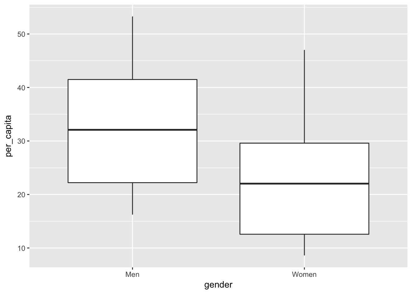
ssa_long %>%
  ggplot(aes(gender, per_capita, fill = gender)) +
  geom_boxplot() +
  facet_grid(~ earnings_type)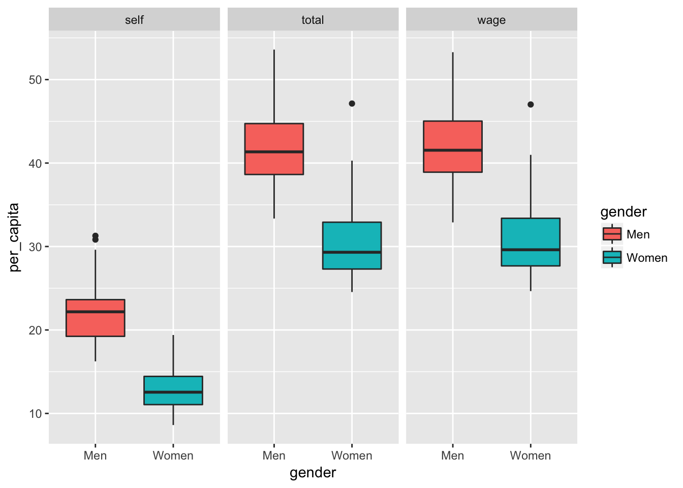
6.3 Violin Plots
Let’s repeat the above plots using the violin plot type.
ssa_long %>%
  filter(earnings_type != "total") %>%
  ggplot(aes(gender, per_capita)) +
  geom_violin()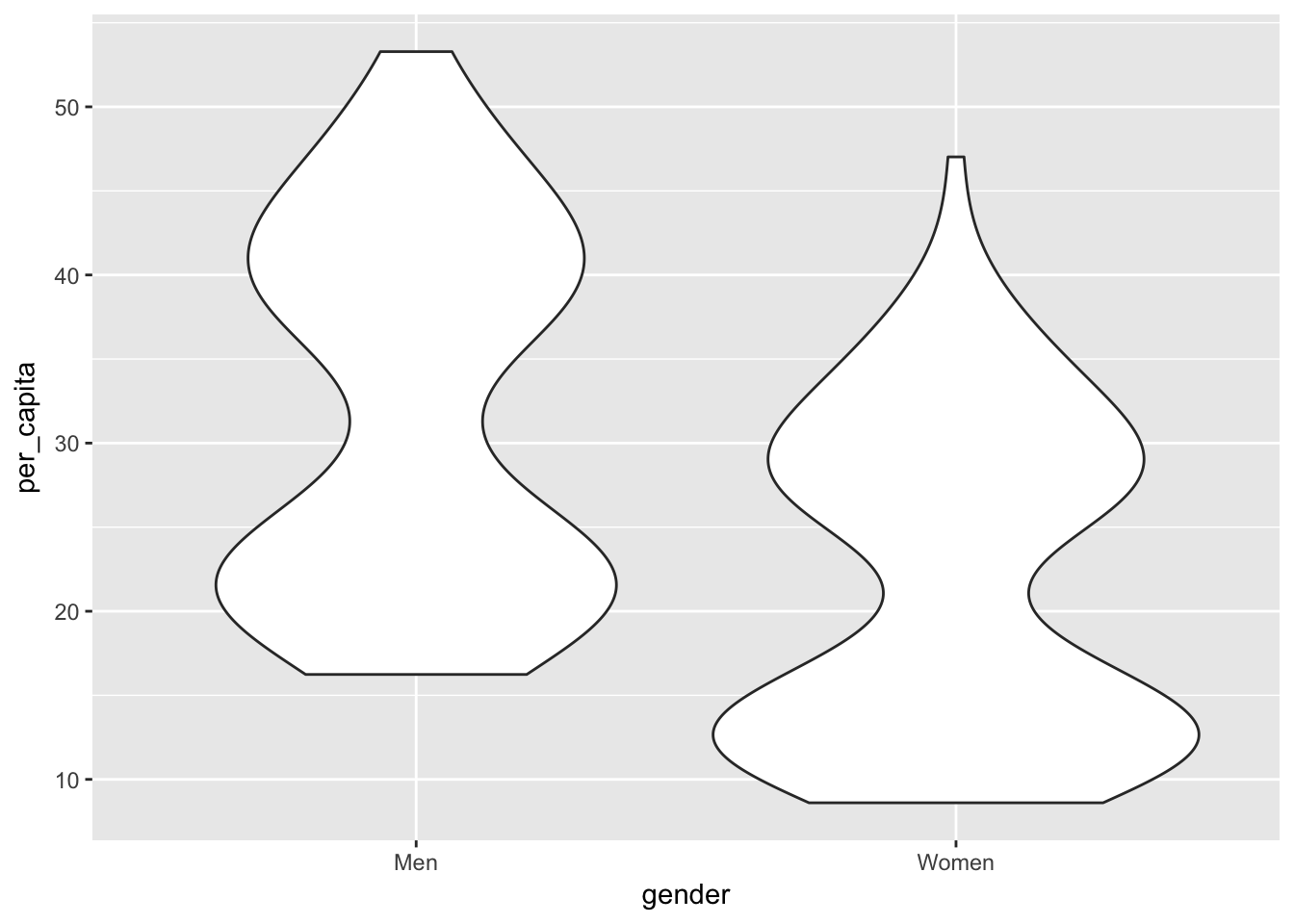
ssa_long %>%
  ggplot(aes(gender, per_capita, color = gender, fill = gender)) +
  geom_violin() +
  facet_grid(~ earnings_type)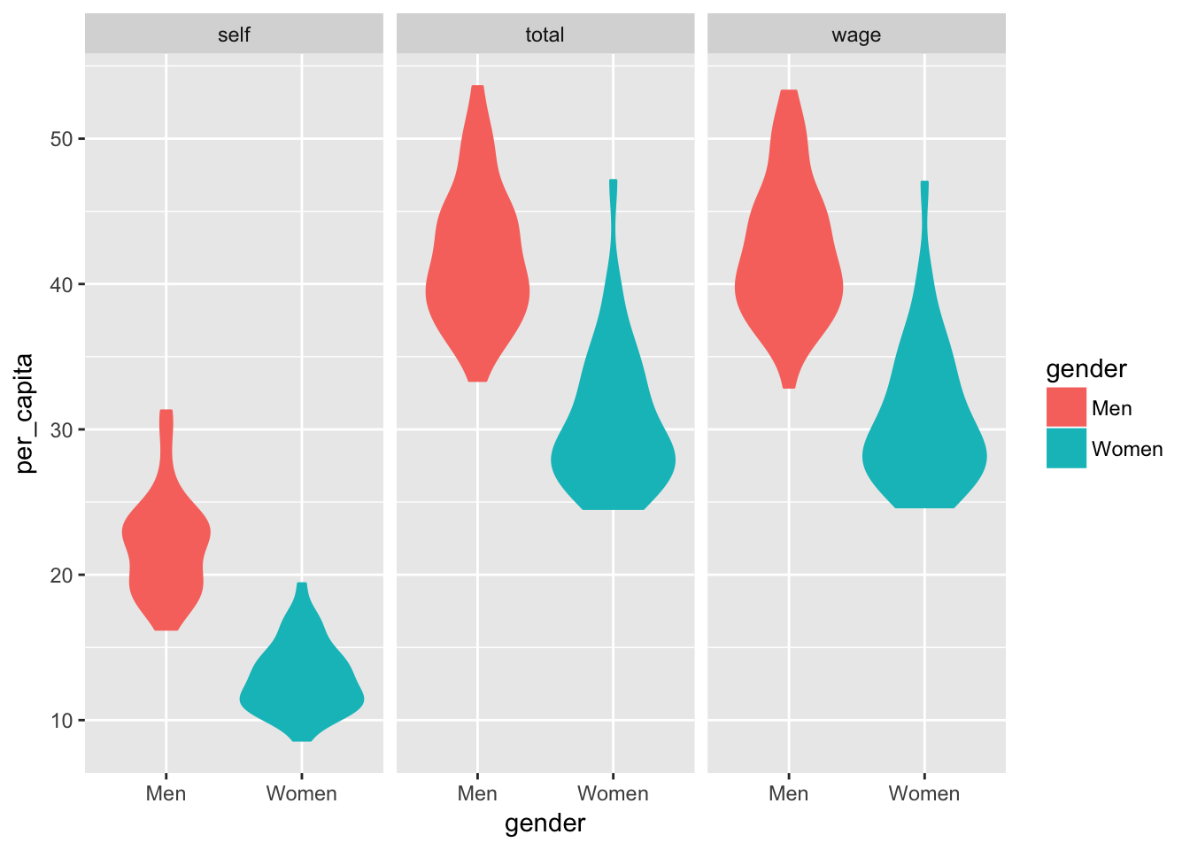
6.4 Dot Plots
Dot plots appear similar to violin plots, but dot plots may be easier to interpret:
ssa_long %>%
  ggplot(aes(gender, per_capita, color = gender, fill = gender)) +
  geom_dotplot(binaxis = "y", stackdir = "center", position = "dodge") +
  facet_grid(~ earnings_type)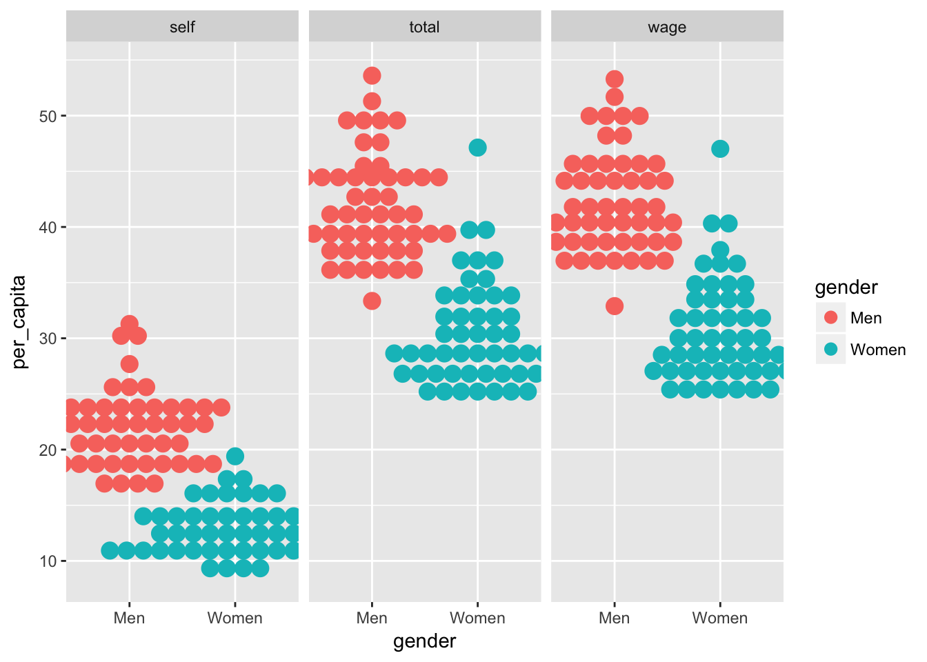
6.5 Assignment
Create your own visualizations of the distribution of the earnings and number variables.