Lecture 10 Themes, Labels, and Colors
This lecture uses the following packages:
tidyverse
lubridate
ggthemes
grid
gridExtra
10.1 Data
10.1.1 Zillow Real Estate Data
Zillow is an online marketplace for real estate. It facilitates connection between buyers and sellers, and in the process collects a large amount of useful economic statistics.
From Zillow’s research data page, we will download the Age of Inventory (Days) CSV. Their list of data definitions at the bottom of the page includes the following entry:
Age of Inventory: Each Wednesday, age of inventory is calculated as the median number of days all active listings as of that Wednesday have been current. These medians are then aggregated into the number reported by taking the median across weekly values.
library(readr)
raw_inventory <- read_csv("data/AgeOfInventory_Metro_Public.csv")
head(raw_inventory)[,1:6]
## # A tibble: 6 x 6
## RegionName RegionType StateFullName DataTypeDescription
## <chr> <chr> <chr> <chr>
## 1 United States Country <NA> All Homes
## 2 New York, NY Msa New York All Homes
## 3 Chicago, IL Msa Illinois All Homes
## 4 Dallas-Fort Worth, TX Msa Texas All Homes
## 5 Philadelphia, PA Msa Pennsylvania All Homes
## 6 Houston, TX Msa Texas All Homes
## # ... with 2 more variables: `2012-01` <int>, `2012-02` <int>10.1.2 Reshaping data with tidyr
Since this data set uses a separate column for each time period, the data is not yet tidy. Let’s fix that. We’ll use the gather() function from the tidyr package (http://tidyr.tidyverse.org/reference/gather.html) to identify the name for the new column that stores the old column names (month), the name for the new column that stores the values in the columns being reshaped (age), and a column selector to identify which columns to reshape (matches() takes a regular expression, see the regex documentation). Lastly, we need to mutate() the month using ymd() from the lubridate package. Into ymd(), we place the original date character (in “YYYY-MM” format) and add a piece for the day (using the “-DD” format), so that each of our month time markers are interpreted as the first day of the corresponding month.
library(lubridate)
if("package:dplyr" %in% search()) detach("package:dplyr", unload=TRUE)
library(dplyr)
library(tidyr)
inventory <- raw_inventory %>% select(RegionName, matches("[[:digit:]]")) %>%
  gather(month, age, matches("[[:digit:]]")) %>%
  mutate(month = ymd(paste0(month, "-01")))
inventory
## # A tibble: 22,713 x 3
## RegionName month age
## <chr> <date> <int>
## 1 United States 2012-01-01 120
## 2 New York, NY 2012-01-01 136
## 3 Chicago, IL 2012-01-01 141
## 4 Dallas-Fort Worth, TX 2012-01-01 109
## 5 Philadelphia, PA 2012-01-01 132
## 6 Houston, TX 2012-01-01 112
## 7 Washington, DC 2012-01-01 105
## 8 Miami-Fort Lauderdale, FL 2012-01-01 89
## 9 Atlanta, GA 2012-01-01 98
## 10 Boston, MA 2012-01-01 116
## # ... with 22,703 more rows10.2 Starting Plot
Let’s start with a simple line plot of all these series. Let’s show what happens if we leave out the group and color aesthetic.
library(ggplot2)
inventory %>% ggplot(aes(month, age)) + geom_line()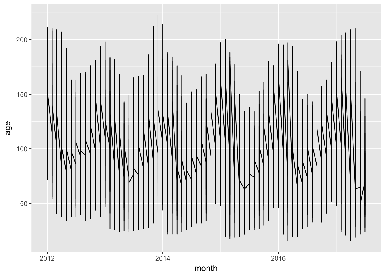
Now, let’s add in the group aes.
inventory %>% ggplot(aes(month, age, group = RegionName)) + geom_line()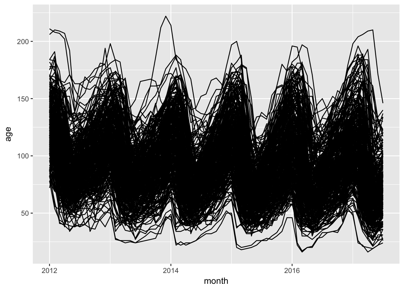
It’s hard to see what is happening in this tangled mess. Setting alpha to 0.1 will make this easier to untangle.
basic_plot <- inventory %>% ggplot(aes(month, age, group = RegionName)) + geom_line(alpha = 0.1)
basic_plot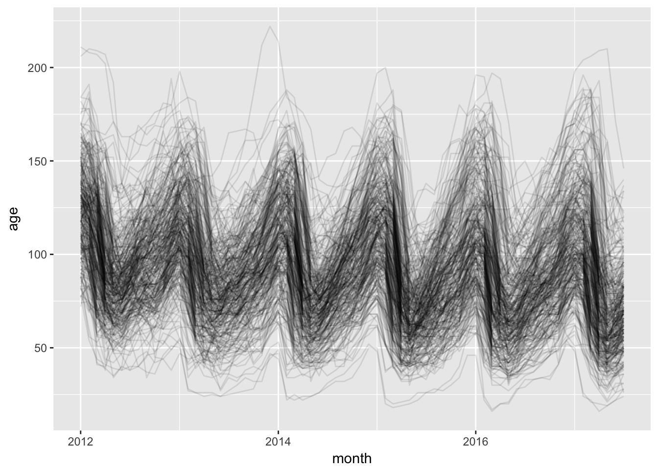
Let’s emphasize the line for Honolulu.
basic_plot +
  geom_line(data = inventory %>% filter(grepl("Honolulu", RegionName)), aes(month, age), color = "blue")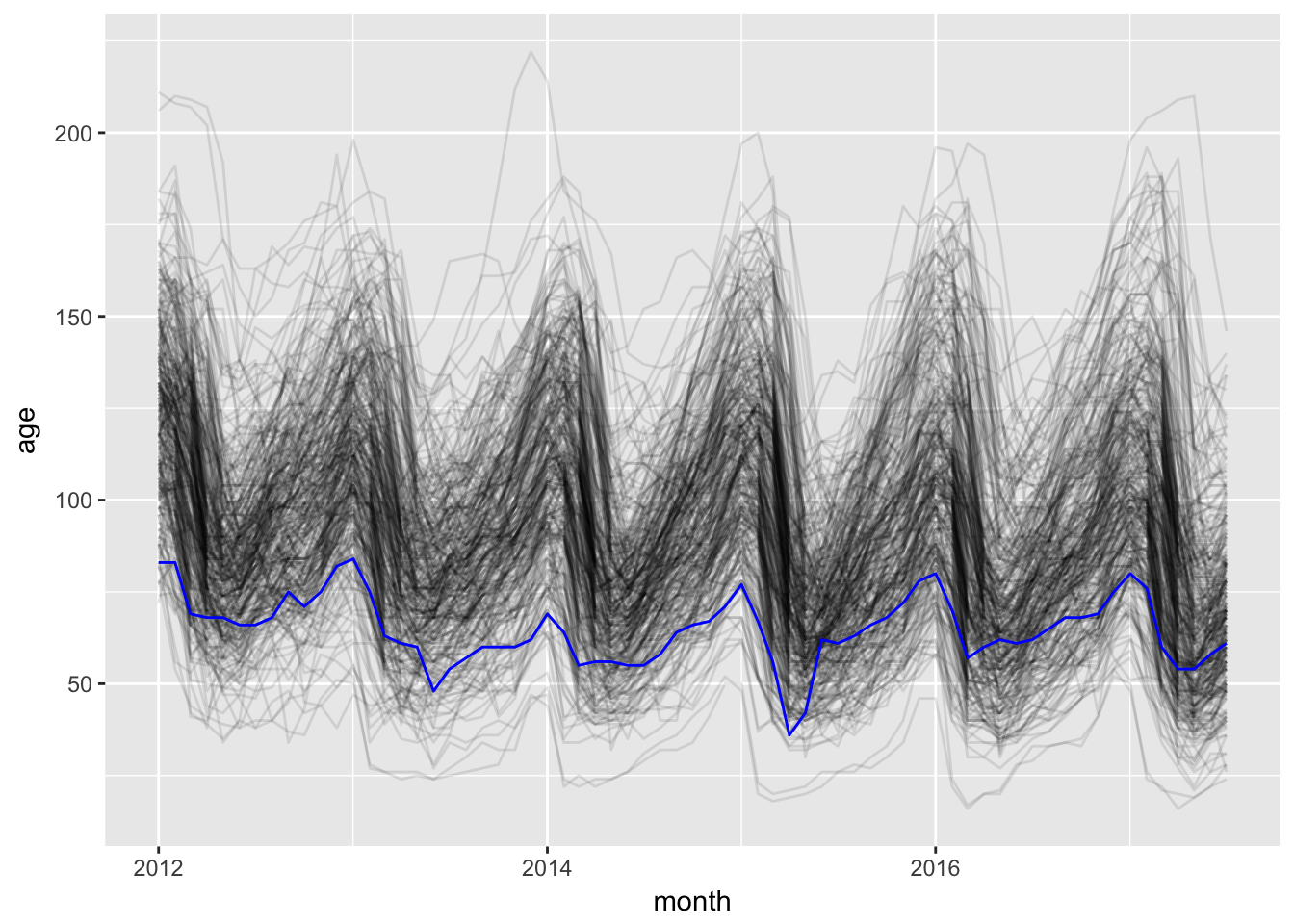
10.3 Themes
10.3.1 Complete Themes
There are a variety of pre-made themes that can make our figures look cleaner (http://ggplot2.tidyverse.org/reference/ggtheme.html). theme_bw() is good if you don’t want to print all the grey from the default, but you still want the same basic structure.
basic_plot + theme_bw()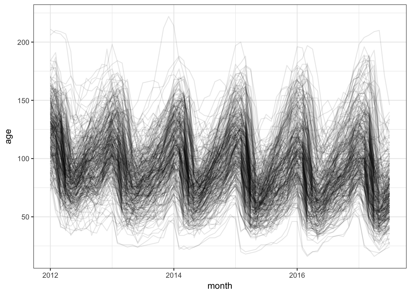
theme_minimal() removes some of the visual clutter, removing the plot border and the axis ticks.
basic_plot + theme_minimal()
theme_void() goes the whole way and removes everything, but the data. It even removes the axis labels.
basic_plot + theme_void()
10.3.2 Modifying a theme
To modify a theme, we just add a call to the theme() function and assign new values to the parts of the plot we want to change (see the theme() reference for more examples: http://ggplot2.tidyverse.org/reference/theme.html).
Let’s start with the theme_bw() and make the chart more minimal.
basic_plot + theme_bw() + theme(
  panel.border = element_blank(),
  panel.grid = element_blank(),
  axis.line = element_line(color = "grey"),
  axis.ticks = element_line(color = "grey"),
  axis.title.y = element_text(angle = 0)
)
10.3.3 ggthemes
The ggthemes package adds a large set of fun themes. See the vignette at https://cran.r-project.org/web/packages/ggthemes/vignettes/ggthemes.html or enter the following command locally after installing the package
install.packages("ggthemes")
vignette("ggthemes", package = "ggthemes")
To make our chart look like it came out of the economist, let’s use theme_economist(). To make the line colors work, we’ll use the economist_pal() color pal
library(ggthemes)
theme_colors <- economist_pal()(2)
inventory %>% ggplot(aes(month, age, group = RegionName)) +
  geom_line(color = theme_colors[1], alpha = 0.1) +
  geom_line(data = inventory %>% filter(grepl("Honolulu", RegionName)),
            aes(month, age),
            color = theme_colors[2]) +
  theme_economist()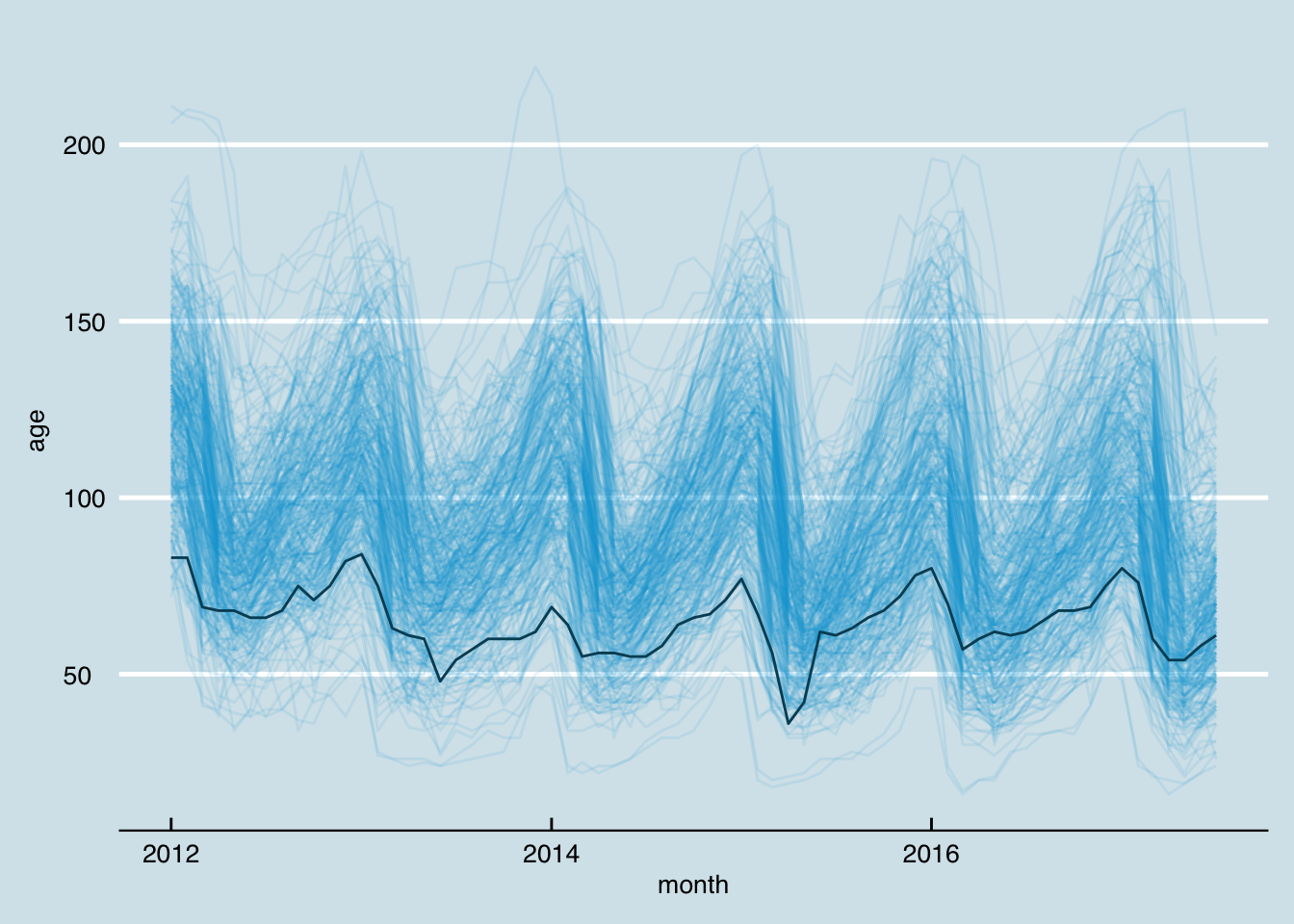
Now let’s try out the theme named for http://fivethirtyeight.com/.
theme_colors <- fivethirtyeight_pal()(2)
five38 <- inventory %>% ggplot(aes(month, age, group = RegionName)) +
  geom_line(color = theme_colors[1], alpha = 0.1) +
  geom_line(data = inventory %>% filter(grepl("Honolulu", RegionName)),
            aes(month, age),
            color = theme_colors[2]) +
  theme_fivethirtyeight()
five38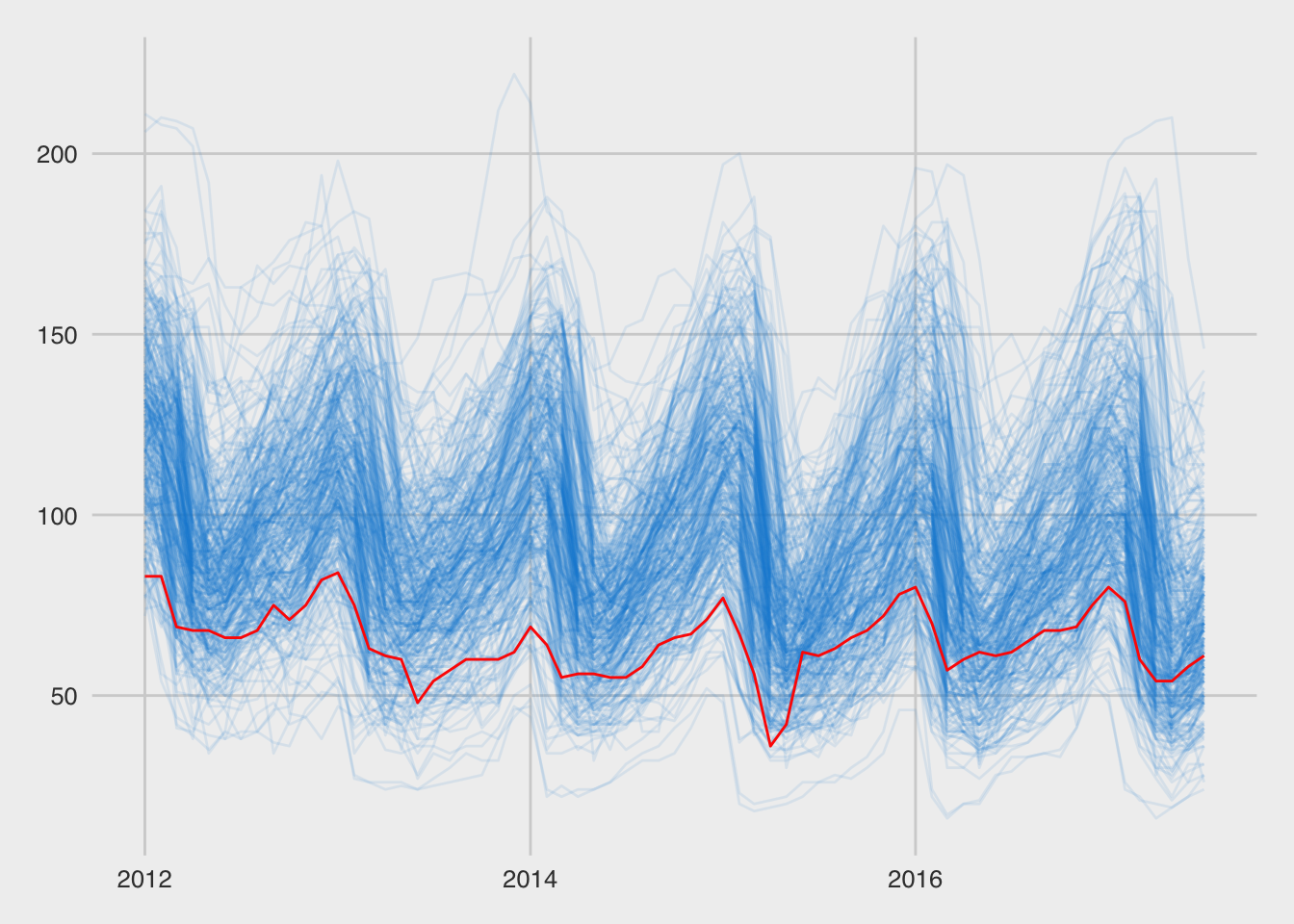
10.4 Labels
Now that we have a nice looking basic chart, we need to make sure our labels are in the right places and give enough information.
10.4.1 Title
Let’s start by adding a title. For a time series like this, using the name of the variable on the x-axis is a good start. We can also change the x-axis to break at each year, which makes the seasonality of this series even easier to pick out. With these added vertical lines, our chart will be more readable if we remove the horizontal gridlines (panel.grid.major.y).
five38_with_title <- five38 +
  ggtitle("Median Days Listed by Metro Area") +
  scale_x_date(date_breaks = "1 year", date_labels = "%Y") +
  theme(panel.grid.major.y = element_blank())
five38_with_title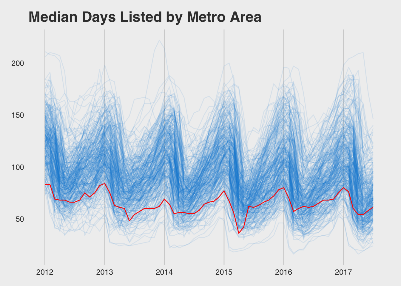
Since we used our title wisely we don’t need to add a y-axis title. The x-axis is time and this is fairly obvious, so we can also leave off the x-axis title. What we should do is label the highlighted series.
last_hnl <- inventory %>%
  filter(grepl("Honolulu", RegionName)) %>%
  top_n(1, month)
gg <- five38_with_title +
  geom_text(data = last_hnl, label = last_hnl$RegionName,
            hjust = "left", nudge_x = 70)
gg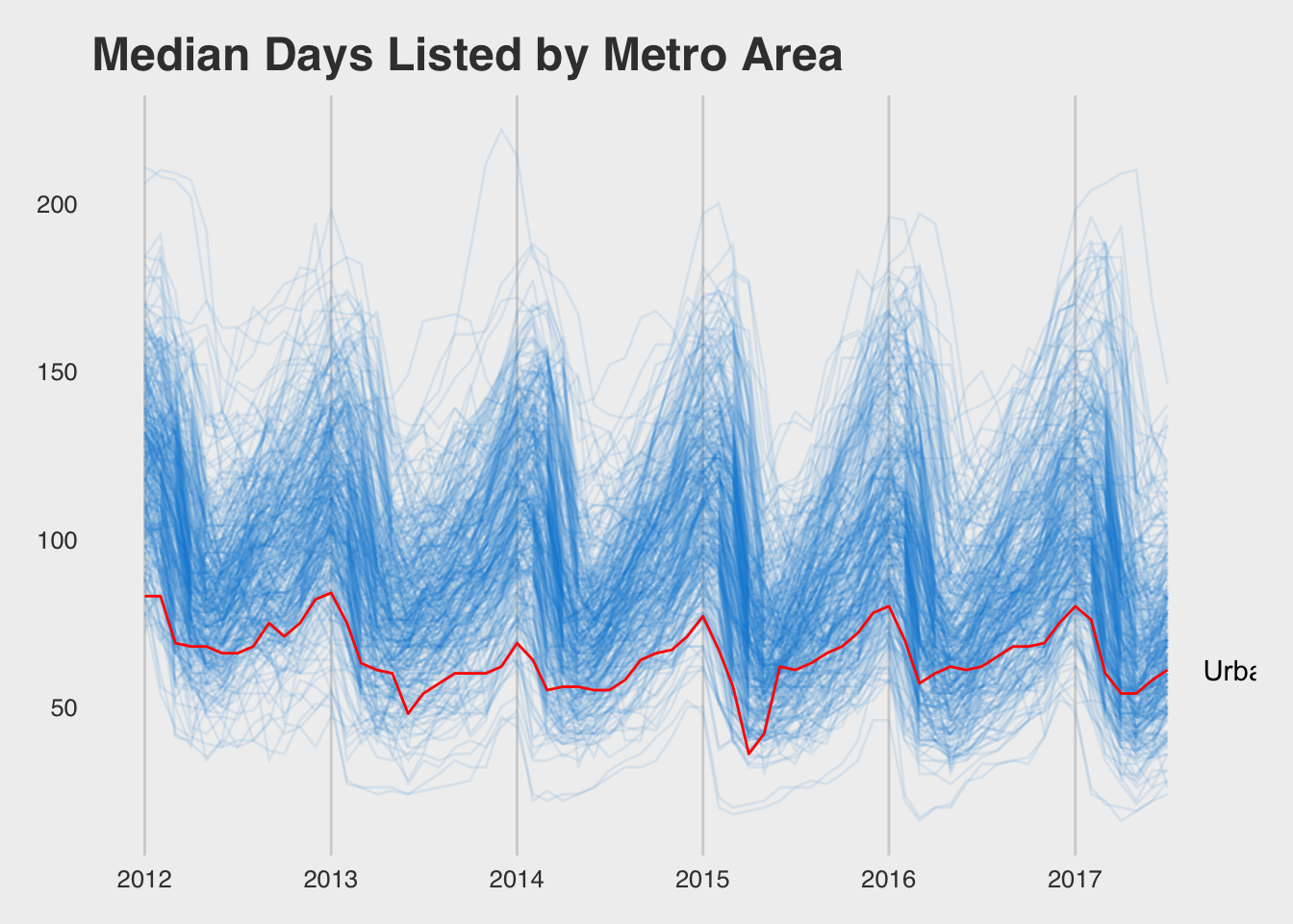
To adjust the margins, we have to drill deeper than ggplot. I found the following approach through searching for ggplot clipping (https://rud.is/b/2015/08/27/coloring-and-drawing-outside-the-lines-in-ggplot/).
library(gridExtra)
library(grid)
gb <- ggplot_build(gg + theme(plot.margin = unit(c(1, 7, 2, 1), "lines")))
gt <- ggplot_gtable(gb)

gt$layout$clip[gt$layout$name=="panel"] <- "off"

grid.draw(gt)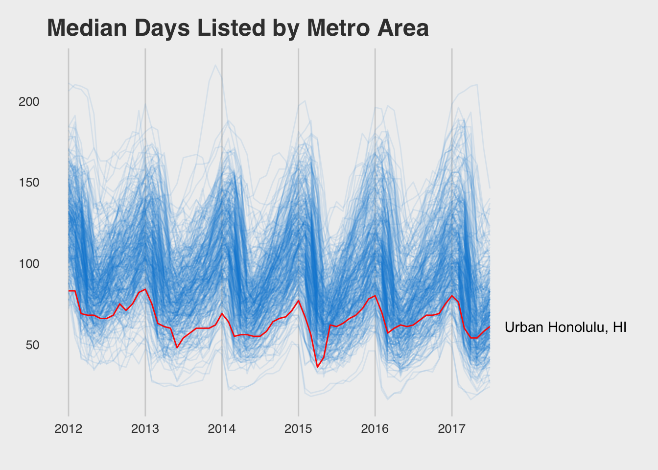
10.5 Colors
Color is an important tool in creating engaging and informative visualizations. Color is often used to encode a dimension not already displayed in a chart (e.g., adding a third dimension to a scatter plot). Above, we used color to highlight a specific set of data points. We used a highlight color for Urban Honolulu and set the other metro areas to a blue with transparency.
10.5.1 Color Scales
An easy way to see the colors within a given color scheme is by using the show_col() function in the scales package. We can use it to show the colors in the theme_colors variable we created above.
library(scales)
show_col(theme_colors)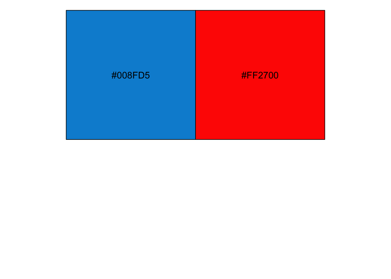
The combinations of letters and numbers in the color squares is the hex representation of the red, green, and blue color values that make up the given color (e.g., #008FD5). Adobe has a fun color chooser where you can paste these hex values and create your own color scheme:
There are not many colors in the fivethirtyeight_pal() color palette (only 3). The economist_pal() palette has 11, which is a bit better for categorical data:
show_col(economist_pal()(11))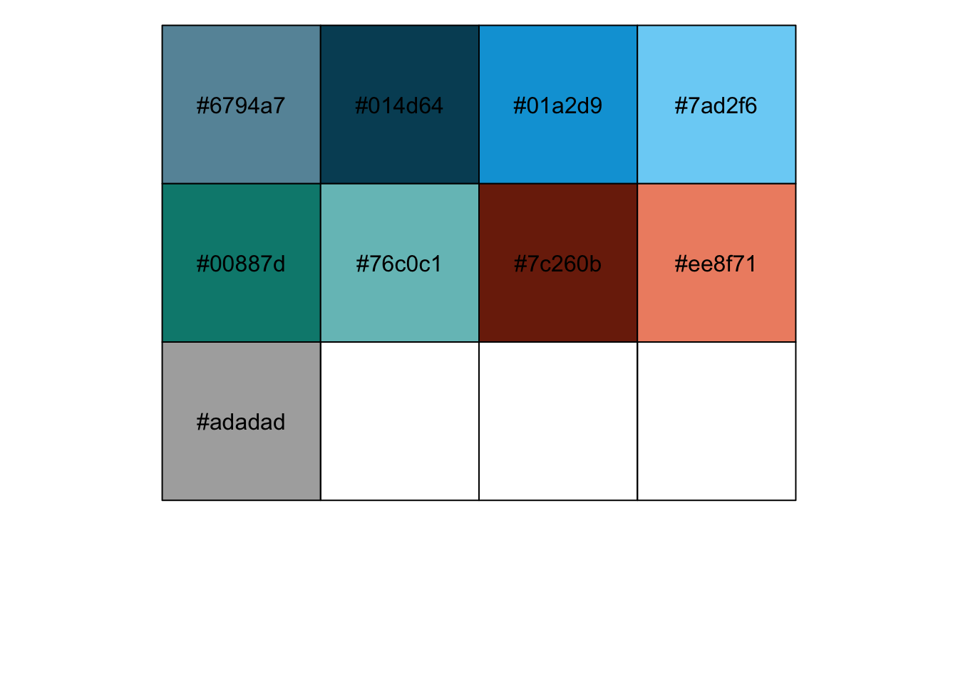
10.5.2 Color Brewer
Color Brewer (http://colorbrewer2.org/) is the gold standard for color choice in maps. The online tool allows you to preview and export color schemes that are designed for accessibility (i.e., color-blind safe) and for the main strategies for encoding data using color (sequential, diverging, and qualitative). Most of these scales are available within ggplot (http://ggplot2.tidyverse.org/reference/scale_brewer.html).
RColorBrewer::brewer.pal.info## maxcolors category colorblind
## BrBG 11 div TRUE
## PiYG 11 div TRUE
## PRGn 11 div TRUE
## PuOr 11 div TRUE
## RdBu 11 div TRUE
## RdGy 11 div FALSE
## RdYlBu 11 div TRUE
## RdYlGn 11 div FALSE
## Spectral 11 div FALSE
## Accent 8 qual FALSE
## Dark2 8 qual TRUE
## Paired 12 qual TRUE
## Pastel1 9 qual FALSE
## Pastel2 8 qual FALSE
## Set1 9 qual FALSE
## Set2 8 qual TRUE
## Set3 12 qual FALSE
## Blues 9 seq TRUE
## BuGn 9 seq TRUE
## BuPu 9 seq TRUE
## GnBu 9 seq TRUE
## Greens 9 seq TRUE
## Greys 9 seq TRUE
## Oranges 9 seq TRUE
## OrRd 9 seq TRUE
## PuBu 9 seq TRUE
## PuBuGn 9 seq TRUE
## PuRd 9 seq TRUE
## Purples 9 seq TRUE
## RdPu 9 seq TRUE
## Reds 9 seq TRUE
## YlGn 9 seq TRUE
## YlGnBu 9 seq TRUE
## YlOrBr 9 seq TRUE
## YlOrRd 9 seq TRUEshow_col(brewer_pal(palette = "Accent")(8))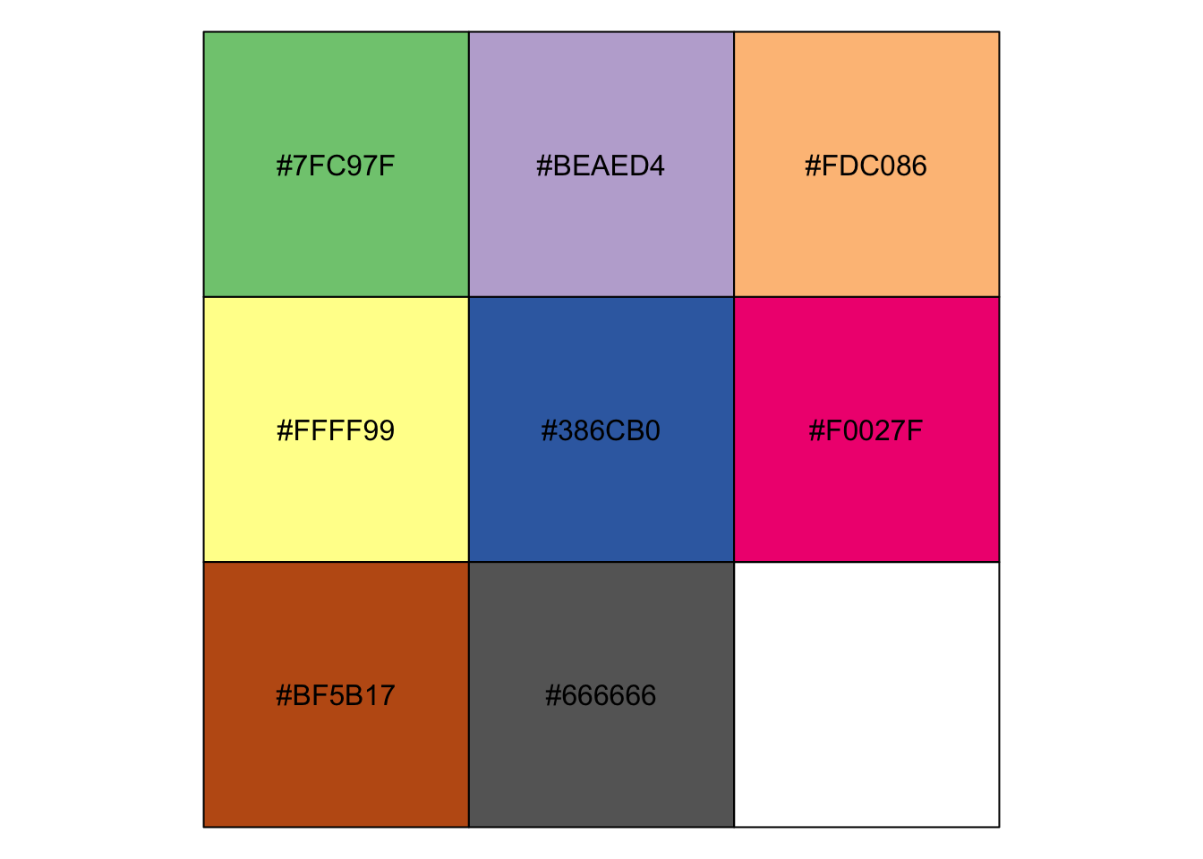
Here’s how to take this color palette and apply it to our previous chart:
theme_colors <- brewer_pal(palette = "Accent")(8)
inventory %>% ggplot(aes(month, age, group = RegionName)) +
  geom_line(color = theme_colors[1], alpha = 0.1) +
  geom_line(data = inventory %>% filter(grepl("Honolulu", RegionName)),
            aes(month, age),
            color = theme_colors[2]) +
  theme_fivethirtyeight()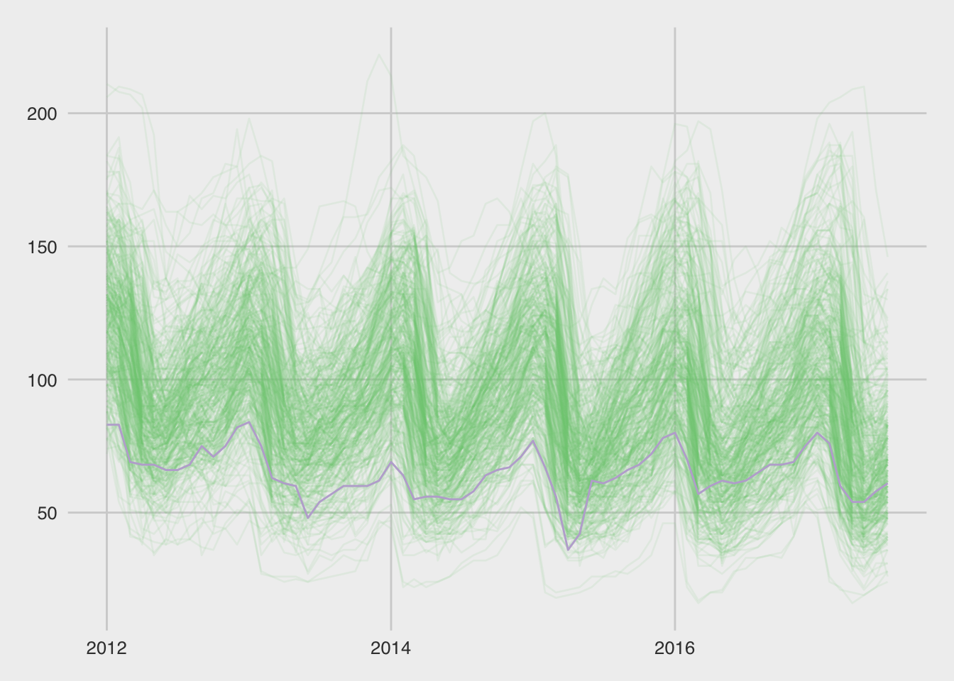
10.6 Assignment
Using the same file, pick a different time series to emphasize (with a different color) and choose a different theme.