Lecture 4 Lines and Curves
4.1 Data
We will use data on the number of active duty personnel in Hawaii. The first dataset is an Excel file pulled from the State of Hawaii Department of Business, Economic Development, and Tourism (DBEDT) 2015 State of Hawaii Data Book. See the line listed as, “10.03 - Active Duty Personnel, by Service: 1953 to 2015.” The data is originally from the US Defense Manpower Data Center
library(tidyverse)
library(readxl)
mil_personnel <- read_excel("data/100315.xls", range = "A5:L38", col_types = "numeric")
mil_personnel <- bind_rows(
mil_personnel %>% select(1:6) %>% magrittr::set_colnames(c("Year", "Total", "Army", "Navy", "Marine Corps", "Air Force")),
mil_personnel %>% select(7:12) %>% magrittr::set_colnames(c("Year", "Total", "Army", "Navy", "Marine Corps", "Air Force"))
)
mil_personnel## # A tibble: 66 x 6
## Year Total Army Navy `Marine Corps` `Air Force`
## <dbl> <dbl> <dbl> <dbl> <dbl> <dbl>
## 1 NA NA NA NA NA NA
## 2 1953 24785 5872 7657 6040 5216
## 3 1954 23654 7957 6443 4155 5099
## 4 1955 40258 19821 5211 9677 5549
## 5 1956 37470 16531 5237 9490 6212
## 6 1957 40683 17511 5466 9608 8098
## 7 1958 35076 14672 4908 8670 6826
## 8 1959 36310 15438 5309 8470 7093
## 9 1960 35412 15492 5687 7756 6477
## 10 1961 39474 16945 5774 9679 7076
## # ... with 56 more rowsNotice that the Year 2015 was turned into NA. This happened because the value in the corresponding cell was ‘2/ 2015’. Let’s remove the final row of NAs and replace the remaining NA with 2015.
mil_personnel <- mil_personnel %>% filter(!is.na(Total))
mil_personnel[is.na(mil_personnel$Year),]$Year <- 2015
mil_personnel
## # A tibble: 63 x 6
## Year Total Army Navy `Marine Corps` `Air Force`
## <dbl> <dbl> <dbl> <dbl> <dbl> <dbl>
## 1 1953 24785 5872 7657 6040 5216
## 2 1954 23654 7957 6443 4155 5099
## 3 1955 40258 19821 5211 9677 5549
## 4 1956 37470 16531 5237 9490 6212
## 5 1957 40683 17511 5466 9608 8098
## 6 1958 35076 14672 4908 8670 6826
## 7 1959 36310 15438 5309 8470 7093
## 8 1960 35412 15492 5687 7756 6477
## 9 1961 39474 16945 5774 9679 7076
## 10 1962 41657 17645 6664 9903 7445
## # ... with 53 more rows4.2 geom_smooth
geom_smooth allows you to have smooth lines appear in your chart. With no argument, it will choose loess for series shorter than 1,000 observations. It shows a shaded confidence interval.
mil_personnel %>%
  ggplot(aes(Year, Total)) +
  geom_point() +
  geom_smooth()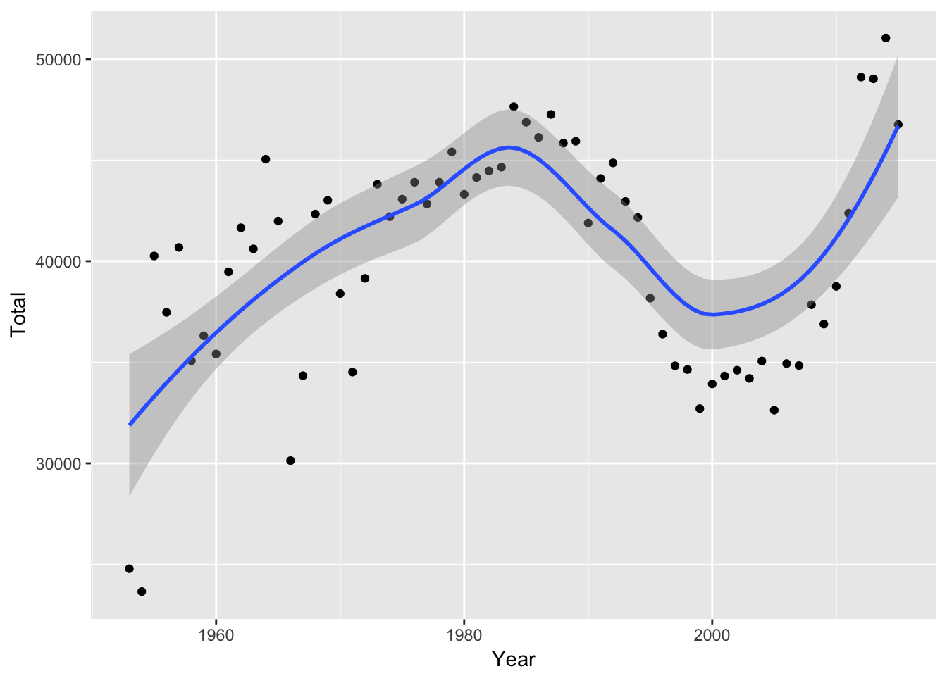
Here’s what it looks like if we fit a linear model instead:
mil_personnel %>%
  ggplot(aes(Year, Total)) +
  geom_point() +
  geom_smooth(method = "lm")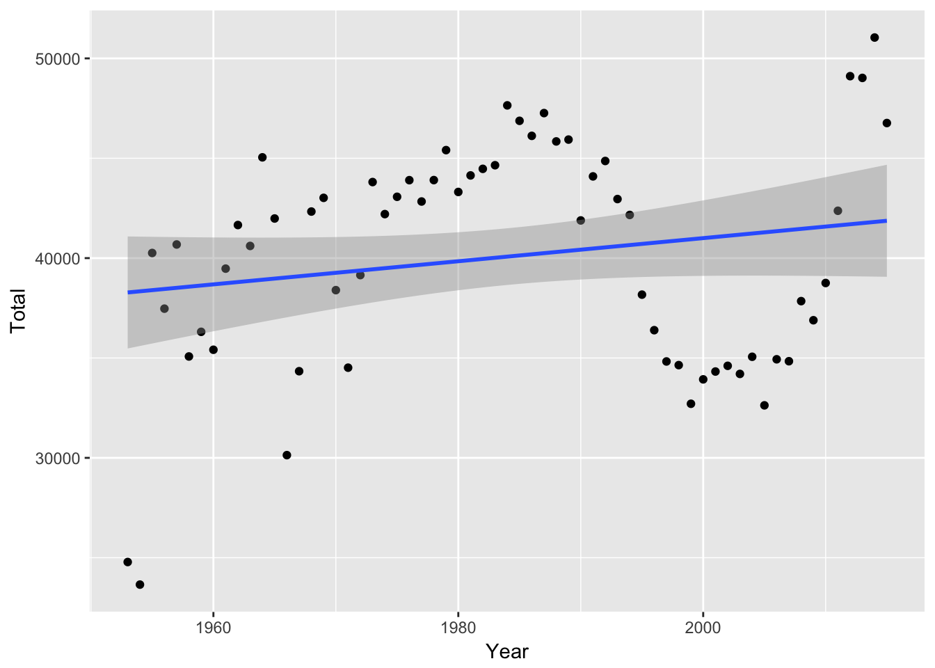
We can also just have a line chart that connects the points:
mil_personnel %>%
  ggplot(aes(Year, Total)) +
  geom_point() +
  geom_line()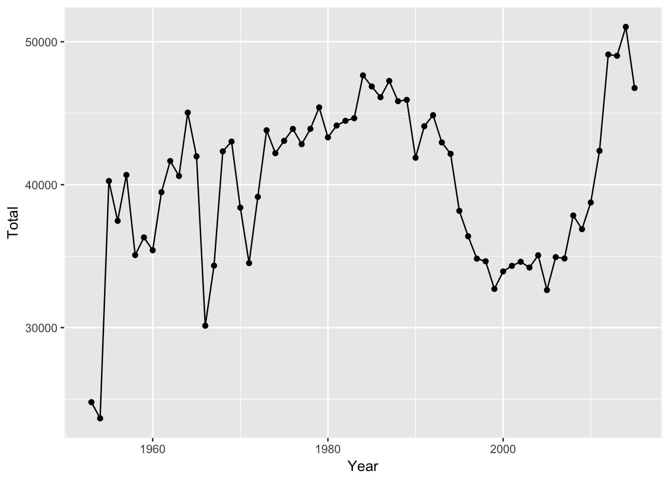
4.3 geom_abline
geom_abline allows you to display lines with a specific intercept and slope. If no intercept or slope is provided, a 45-degree line will be shown.
x = rnorm(100)
y = 2.5 + 1.2 * x + rnorm(100)
test_data <- data_frame(x, y)

test_data %>%
  ggplot(aes(x, y)) +
  geom_point() +
  xlim(-2, 6) + ylim(-2, 6) +
  coord_fixed() +
geom_abline() 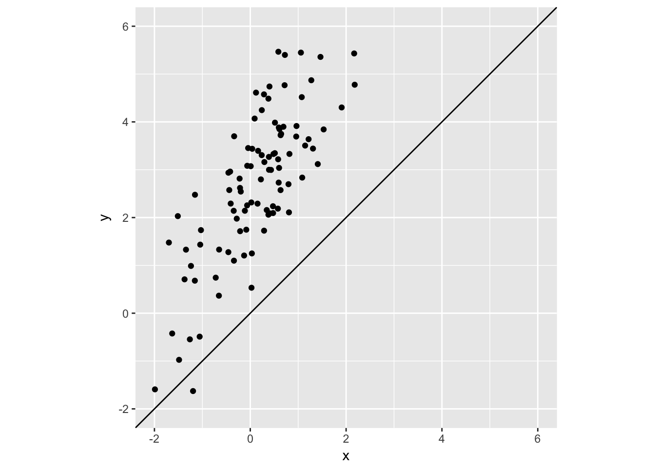
test_data %>%
  ggplot(aes(x, y)) +
  geom_point() +
  xlim(-2, 6) + ylim(-2, 6) +
  coord_fixed() +
  geom_abline() +
geom_abline(intercept = 2.5, slope = 1.2, color = "red") 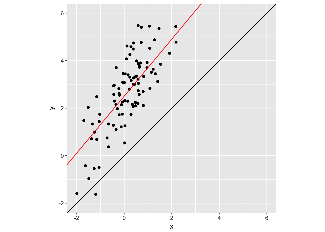
4.4 geom_vline
geom_vline allows you to draw vertical lines by specifying an x intercept.
test_data %>%
  ggplot(aes(x, y)) +
  geom_point() +
  xlim(-2, 6) + ylim(-2, 6) +
  coord_fixed() +
  geom_abline() +
  geom_abline(intercept = 2.5, slope = 1.2, color = "red") +
  geom_vline(xintercept = 2, color = "blue")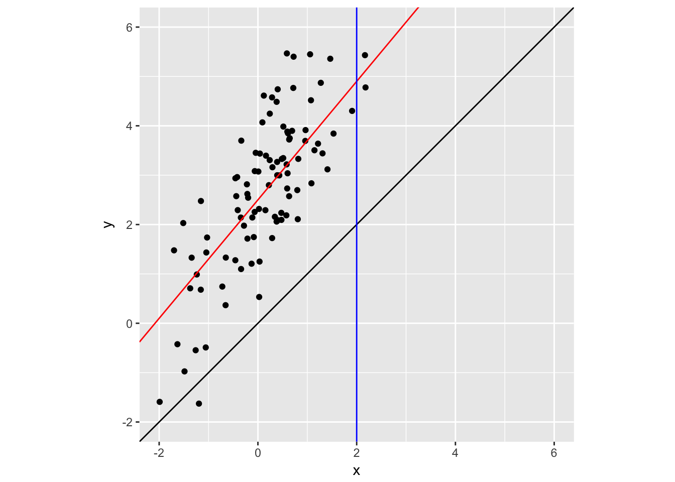
4.5 hline
geom_vline allows you to draw vertical lines by specifying an x intercept.
test_data %>%
  ggplot(aes(x, y)) +
  geom_point() +
  xlim(-2, 6) + ylim(-2, 6) +
  coord_fixed() +
  geom_abline() +
  geom_abline(intercept = 2.5, slope = 1.2, color = "red") +
  geom_vline(xintercept = 2, color = "blue") +
  geom_hline(yintercept = 1, color = "#4FCC53", lty = 2)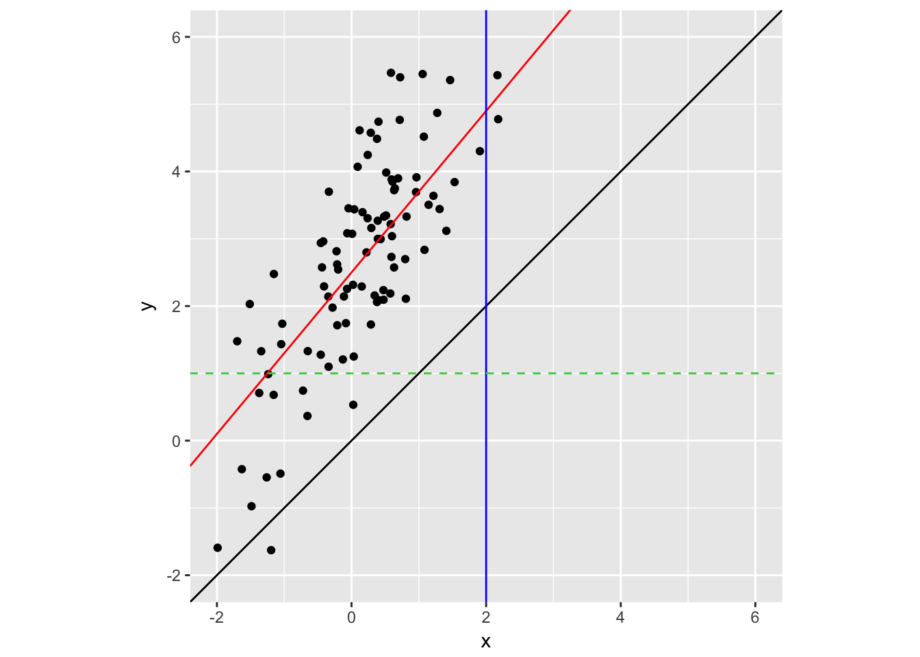
4.6 Assignment
Create a visualization of the military data by branch (i.e., Army, Navy, etc.) using facet_wrap(). Plot both the points and a smooth line.
The data we have been working with is not yet tidy. Each row contains multiple observations (observations for Army, Navy, etc.). To make this tidy we should have one column with the personnel counts and one column that indicates the branch.
tidy_mil <- mil_personnel %>%
  gather(branch, personnel, -Year)
tidy_mil
## # A tibble: 315 x 3
## Year branch personnel
## <dbl> <chr> <dbl>
## 1 1953 Total 24785
## 2 1954 Total 23654
## 3 1955 Total 40258
## 4 1956 Total 37470
## 5 1957 Total 40683
## 6 1958 Total 35076
## 7 1959 Total 36310
## 8 1960 Total 35412
## 9 1961 Total 39474
## 10 1962 Total 41657
## # ... with 305 more rows